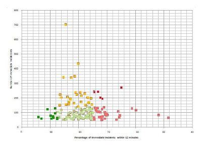
 I know I am in danger of becoming boring and repetitive but getting this right is important to my research. Again I am using the CAD immediate call dataset. I have excluded all grid squares that had less than 50 immediate incidents in 2009 on the basis of the low number problem discussed previously. My colour selection has been a bit random up to now. The traffic light system is commonly used in management reports in the MPS so I have decided to use it here as the police are the target audience for this data. Red represents areas of concern, green good areas and amber in between. I have used two reds and two greens, the dark colours represent the extremes. You will notice that I have decided that the overlapping blue/green squares used previously should be a separate cluster. These are the grid squares of most concern and shown as dark red.
This to a certain extent is a subjective decision about the relative importance of response times and number of incidents within a grid square on public perception. Arguably the grid squares on the extreme right of the graph should also be dark red. I should perhaps follow my own advise and keep the data raw. I should decide which data indicate police activity, in this case response time and which data indicates public demand, in this case number of incidents.
No comments:
Post a Comment