We are told that Diana death was accidental, Dr David Kelly's death was suicide and Bob Woolmer's death was by natural causes but many people believe that one or more of these deaths was murder.
Bob Woolmer, for those who do not know, died on 18th March 2007 in his hotel room in Kingston, Jamaica when he was the Pakistan's cricket coach at the Cricket World Cup in the West Indies. His death was investigated as murder with suggestions that it was in some way linked to Asian betting syndicates. Perhaps he had found out that some Pakistan players colluding with the syndicates contributed to Pakistan losing to Ireland the previous day and was going to spill the beans.
I had been following Bob Woolmer's career since the early 1970s because I had been told that he was an old boy from a school I went to in Derbyshire. It appears that this "fact" is actually wrong but it has not meant I did not believe it for about 40 years.
And this is my point - a person's perception is often more relevant and powerful than facts. Fear is based on perception.
The British endearingly often fall into the trap of thinking that because a person speaks English and perhaps plays cricket that they have the same background, attitudes and values as them. The fact is Pakistan is about as different as you get to Britain; crime and the rule of law are a world apart.
Everyone in England seems to assume that the latest cricket betting scandal, this time involving Pakistan, is about individual cricketers making money. What if money is not the primary motivation but fear? Are they seriously advocating banning an 18 year old (probably the best fast bowler of his age in the history of the game) for life because he was probably doing what he was told and feared the consequences if he did not?
Monday, 30 August 2010
Thursday, 26 August 2010
The historical exploits of James Cousins
There is something very British about this story and one that is not totally unrelated to the previous blog posting.
James Cousins, an elected Conservative Councillor seems to have spent a disproportional amount of time over the last 18 months point mapping robberies and burglaries on Google Maps for the benefit (primarily) of Wandswoth residents. He had been regularly given the information I assume from the Metropolitan Police Service (MPS) in his official capacity as part of the Wandsworth Community Safety Partnership.
James Cousins obviously thought that the information he was being given was far more useful than the official MPS website and something which he should share. By producing point data maps with details of the crime for the public he was, out of ignorance or through bravadory going against MPS policy and current Data Commissioner's advice regarding privacy. But he managed to do it for 18 months without problem or complaint from those supposedly affected. He has only had to stop because someone in Harrow Council did not like what he was doing. The reasons given were privacy, raising the fear of crime and giving criminals information that they might fine useful.
James Cousins like a batman given out wrongly in cricket has walked back to the pavillion without a hint of dissent. I hope the history of crime mapping for the public will remember his exploits.
Wednesday, 25 August 2010
At last a "crime" to investigate!
Colin D from SpotCrime kindly alerted me to the fact that SpotCrime and CrimeReports are currently in dispute. He gave me this link to a commentary on the case entitled "Who owns public crime data?". A very important and relevant question and one which the the article mysteriously fails to address let alone answer. It does however, very usefully have the full 52 page civil court complaint made by (effectively) CrimeReports against SpotCrime.
The allegation, put simply, is that SpotCrime is taking data in bulk from the CrimeReports websites by sophisticated means which SpotCrime is having difficulty preventing. The data that they are taking has been provided to CrimeReports by numerous police departments across the country who pay CrimeReports to provide the data (relating to police incidents, including crime) to the public in an approved format and detail. SpotCrime admit (it appears) to scraping the data from the CrimeReports website and then putting it on their own websites which unlike CrimeReports includes advertising to generate income. They also are selling the data in the form of alerts to media companies it appears. SpotCrime defence seems to be that the data are public property, in the public domain and therefore they have as much right to it as CrimeReports.
I have been grappling with the problem of who owns police crime-related data for about 20 years now. In 1994 I wrote "Facilitating Public Access to PNC stolen vehicle data" for the Association of Chief Police Officers and for the Home Office. This was the first crime data that the police in the UK provided to the public on an enquiry basis and it used a privately owned commercial company to do so who effectively sold the information to the public. The report, which I am proud of, had to cover ownership issues and whether the data had monetary value; it also covered the purpose of providing it to the public. At that time there were not issues regarding the public nature of data though the Freedom of Information Act subsequently enacted has changed this.
I am not going to go into the details of my argument because it would take too much space but it is clear to me that despite the public nature of the data they are owned by the police departments that produced them. It becomes jointly owned by CrimeReports who have entered into a mutually beneficial contract. CrimeReports have a degree of ownership due to adding value to the data that carries with it a duty to protect its integrity and security.
Having come to this conclusion, that carries with it the assessment that the data have monetary value, I see CrimeReport/Spotcrime case, despite it not being treated as such, as an allegation of theft, though it is probably easier to prove computer hacking offences.
Tuesday, 24 August 2010
Good & not so good Crime/Policing Mapping Sites 4 – CrimeReports


CrimeReports go about things in the right way, they obtain their data from police agencies, so my confidence in the provenance of their data is high. They make their money from the data provider so there is no annoying advertising on their site.
CrimeReports philosophy seems to be that people should have access to information about crimes that are going on around where they live, work and frequent. It is therefore best viewed on a small neighbourhood scale.
What are the faults?
The main one is to do with the title - Crime Reports. This is an ambiguous title and one which makes most people assume (I think) that the data come from the police crime recording system that has a comprehensive record of reported crime. This appears not to be case. Most, if not all the data comes from the police Computer Aided Dispatch (CAD) system that manages the deployment of police units to incidents. The problem with this is that a significant proportion of crimes are reported without incidents being created and therefore the data is not as comprehensive as the title suggests. Secondly I suspect that CAD system in the USA, like the UK, is not standardised so it is difficult to compare different police force areas on the basis of this data.
This is not huge difficulty and one of semantics which can easily be solved by CrimeReports being bit more transparent.
After all it would be churlish of me to be over critical as I am advocating Policing Maps for the public based on incident data.
The thin blue line
If you want a bit of a laugh and have 10 minutes to spare this is for you. It is of course not based on reality!!
Monday, 23 August 2010
Crime-ridden Finland - I do not think so.

The last blog about Mexico reminded me how misleading United Nations crime figures of countries are. The table above shows the top twenty countries in the world ( plus Mexico at 39) regarding recorded crime per capita. This has Finland as the third most crime ridden country in the world with an apparent crime rate eight times higher than Mexico. The reason why I pick out Finland is because it was nominated by Newsweek magazine as the best place in the world to live and the country with the fourth best quality of life.
Clearly a high recorded crime rate can be an indication of a well run efficient society with probably relatively low crime. Equally a low recorded crime rate can indicate inefficient, badly run, high crime societies. There are so many counterbalancing forces here that in fact the total recorded crime rate actually indicates very little for comparision purposes between countries.
Fear, Fear and more Fear


I post the maps today because of this story. You can learn more about the ongoing saga of murder and mayhem by following the links on the BBC website. This is the one I found most distressing and this the most shocking.
Friday, 20 August 2010
Good & not so good Crime/Policing Mapping Sites 3 - SpotCrime


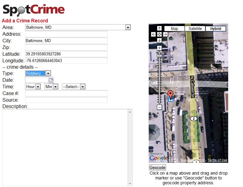
The software supporting the site is good though. SpotCrime seem to be developing mylocalcrime.com. They claim it is fast and they are right - impressively so. The software behind reporting a crime is good. The way in which you specifically locate the crime on GoogleMaps to give highly accurate co-ordinates is something all police forces should duplicate.
Good & not so good Crime/Policing Mapping Sites 2 - IR3

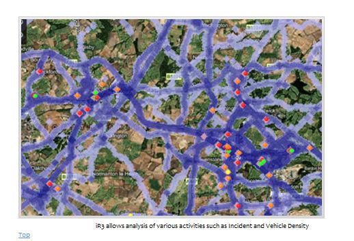
Now if they or any other force who is using the system did publish it on the web for the public it would be ground breaking and what I would happily define it as second generation.
Thursday, 19 August 2010
Good & not so good Crime/Policing mapping sites 1 - MyNeighbourhoodupdate.net


The first site appears relatively new and approaches what I see as second generation crime mapping. To put it simply first generation by my definition maps the location and times of crimes to a varying degree of accuracy and comprehensiveness. Second generation crime maps should focus much more on police activity tackling the policing problems within neighbourhoods with the purpose of addressing communication, reassurance, crime prevention, confidence, performance and funding issues. Second generation crime maps are therefore "Policing Maps" for the public.
I give Myneighbourhoodupdate.net a big thumbs up because it uses police incident data to map police activity.
Wednesday, 11 August 2010
Explaining clustering to non- mathematicians and non-geographers 6


Explaining clustering to non- mathematicians and non-geographers 5


It is actually very useful as it allows me to quickly see the similarities and variations produced by the different clustering methods.
Tuesday, 10 August 2010
Explaining clustering to non- mathematicians and non-geographers 4
In the previous posts on this topic I have given details of my dataset of 28 variables of police force expenditure, discussed how this can be mapped in 28 dimensional space to provide unique locations for each force, and then introduced the concept of dividing the forces into hierarchical clusters based on the locations of the forces. The process I illustrated was in the previous post was the divisive or top down approach that starts off with all the forces in one cluster and then divides into two, then three, then four clusters, etc. until there are 43 clusters containing one force each. This is how most non-mathematicians approach clustering I think.
An alternative approach and one which is simpler mathematically is the bottom up or agglomeritive approach. This starts with 43 separate clusters and ends up with one through the merging of clusters.
The important thing to grasp in this post is that the criteria for clustering is based on a measurement of distances between clusters and this distance can be measured in various different ways. The example I am illustrating is calculated using SPSS version 17 software. I have selected the euclidean distance measure (squared - recommended by SPSS - gives longer distances more weight), which is basically the shortest distance between two points and measuring to the centre (or centroid) of the cluster. The process uses the agglomeritive approach.
The process starts with 43 clusters each with the membership of one force. The centroid of each cluster is therefore the location of that force in the 28 dimensional space that the computer calculates by plotting the values of the 28 variables relating to each force. The computer is then asked to find the closest two centroids (euclidean distance wise) which happens to be Bedfordshire and South Yorkshire (these are the most similar forces as far as expenditure patterns are concerned). It then merges the two clusters together (now there are 42 clusters) and calculates the centroid of that new cluster. It then looks for the closest two clusters again. This time Derbyshire and Kent clusters are merged and the centroid calculated of that new cluster (now 41clusters). The closest two clusters are again found. This time the Bedfordshire, South Yorkshire cluster is merged with Durham (40 clusters).

1 Avon & Somerset, 2 Bedfordshire, 3 Cambridgeshire, 4 Cheshire, 5 City of London, 6 Cleveland, 7 Cumbria, 8 Derbyshire, 9 Devon & Cornwall, 10 Dorset, 11 Durham, 12 Dyfed-Powys, 13 Essex, 14 Gloucestershire, 15 Greater Manchester, 16 Gwent, 17 Hampshire, 18 Hertfordshire, 19 Humberside, 20 Kent, 21 Lancashire, 22 Leicestershire, 23 Lincolnshire, 24 Merseyside, 25 Metropolitan Police, 26 Norfolk, 27 North Wales, 28 North Yorkshire, 29 Northamptonshire, 30 Northumbria, 31 Nottinghamshire, 32 South Wales, 33 South Yorkshire, 34 Staffordshire, 35 Suffolk, 36 Surrey, 37 Sussex, 38 Thames Valley, 39 Warwickshire, 40 West Mercia, 41 West Midlands, 42 West Yorkshire, 43 Wiltshire
This Agglomeration Table is produced by SPSS. It takes little bit of understanding. I listed the forces in alphabetical order so the numbers relating to the clusters relate to the forces as shown (but remember by cluster 2 by stage 3 has two forces in it 2 & 33, you are given help in this in the last 3 columns). The stages refer to the stage in the process, so stage 1 is when 42 clusters are formed from 43. The Coefficient column gives an indication of how good the fit of the clustering is. For instance it appears that 33 & 32 clusters (stages 10 & 11) are a better fit than 34 clusters (stage 9).
I am interested in the Metropolitan Police - 25 so it the other end of the table that is of interest.

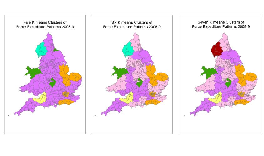
Cluster 3 (Cambridgeshire) is merged with cluster 37 (Sussex) at stage 33 (11 clusters). At stage 34 the Metropolitan Police (25) is merged with that 3 cluster. This means that the Metropolitan Police is one of the last forces to be put in a cluster with other forces but it is by no means the most dissimilar force as far as expenditure is concerned. It probably comes about 7th in the list behind Cumbria, City of London, Avon and Somerset, Warwickshire, North Wales and Norfolk. Interestingly 6 clusters is a better fit than 7 clusters.
The maps of clusters 2 to 7 are displayed in the previous post. Even though the actual process is agglomeritive it is easier for non-mathematicians to visualise it as if it is divisive.
Friday, 6 August 2010
Explaining clustering to non- mathematicians and non-geographers 3


In the last post I explained how the expenditure patterns of forces can be mapped using 28 variables to create exact locations for each force in a 28 dimensional space. In this post I provide hopefully self-explanatory maps and diagrams of the results of one of the clustering methods. The diagrams of the dots, are of course, purely illustrative as I, nor anyone else can depict 28 dimensions in two dimensions. This is a hierarchical method of clustering based on centroids. I will explain the method in the next post.
What I want you to note now is the fact that hierarchical clustering starts with one cluster which is divided into two, the third cluster involves the division of one of the two clusters, four clusters are made through dividing one of the three clusters, etc., etc. For instance, the two clusters shown above consist of Cumbria (in the northwest) and City of London Police (in the centre of London) as one cluster and the other 41 forces in the other cluster. The third cluster is made from dividing the 41 forces. The fourth by dividing Cumbria and the City of London, though if the data were different it could be the one of the offspring clusters of the 41 that was further sub-divided at this stage. This family tree type structure with parents and offspring - hierarchical provides a rigid structure which only allows the division of existing clusters. This means that after the first division Cumbria and the City of London could never be clustered with another force. So if the "best fit" (I will try to explain this later) at the seven cluster stage involved Cumbria (say) being clustered with other forces this will never be achieved using this method.
Thursday, 5 August 2010
Explaining clustering to non- mathematicians and non-geographers 2
What I am trying to achieve with clustering is to group police forces together based on the similarity and differences in the data I have selected from the HMIC value for money spreadsheet as I have discussed in the previous post.
Importantly each datum relates to a police force (via the row in the spreadsheet) and to specified expenditure (via the column); and each datum has a numerical value.
Now this is what you must grasp - that numerical value (in this case all percentages) becomes a co-ordinate in a similar way to map co-ordinate. On a flat two dimensional map a location can be described by a two coordinates, X,Y; latitude, longitude; etc. By selecting any two of my 28 variables the locations forces can be plotted on a flat "map". Those forces whose variable values are close numerically are close on the map, those that are more different numerically are further away on the map. If three variables are selected the map becomes three dimensional. If I include all 28 variables then the map becomes 28 dimensional. This is of course impossible for a human to visualise but easy for a modern computer to chart, but of course not display.
The fact that you must accept is that each force is very precisely located in this 28 dimensioned map. Each force has one location and this point will always be the same if the same variables are used with the same values. It does not matter if more forces are added or taken away, this will not vary the location of the other forces. This mapping of the forces in imaginary space is the first part of the clustering process. You will not become confused later in the process if you tell yourself that the locations are fixed and do not move for the rest of the process.

So the locations of the forces are now fixed for this calculation. Now the next part of the process is where the variations in the end result is introduced. How do you decide how to cluster the above set of dots into 2, 3, 4, 5, 6, 7, etc groups? That is for next time.
Importantly each datum relates to a police force (via the row in the spreadsheet) and to specified expenditure (via the column); and each datum has a numerical value.
Now this is what you must grasp - that numerical value (in this case all percentages) becomes a co-ordinate in a similar way to map co-ordinate. On a flat two dimensional map a location can be described by a two coordinates, X,Y; latitude, longitude; etc. By selecting any two of my 28 variables the locations forces can be plotted on a flat "map". Those forces whose variable values are close numerically are close on the map, those that are more different numerically are further away on the map. If three variables are selected the map becomes three dimensional. If I include all 28 variables then the map becomes 28 dimensional. This is of course impossible for a human to visualise but easy for a modern computer to chart, but of course not display.
The fact that you must accept is that each force is very precisely located in this 28 dimensioned map. Each force has one location and this point will always be the same if the same variables are used with the same values. It does not matter if more forces are added or taken away, this will not vary the location of the other forces. This mapping of the forces in imaginary space is the first part of the clustering process. You will not become confused later in the process if you tell yourself that the locations are fixed and do not move for the rest of the process.

Wednesday, 4 August 2010
Explaining clustering to non- mathematicians and non-geographers 1

I am going to attempt to explain why I am doing this and how in a non-mathematical way. If you want it explained in numbers and formulae I recommend my hero in these matters Dr Kardi Teknomo who gently guides you through the subject in his brilliant tutorials which can be found here.
I have drawn your attenion to HMIC reports and an Audit Commission Report in recent posts. These compare different aspects of Home Office police forces in England and Wales' performance and expenditure. As these police forces have unique geographic juridiction these comparisons are geographically based. I am using data from the HMIC police force value for money profiles that can be found here. And specifically from the spreadsheet that can be found here. My interest is specifically to do with the Metropolitan Police Service (MPS) with responsiblity for London. I had a quick look through the report. The first page has the following;

My impression of the data presented was that the MPS is nothing like the forces it is grouped with. So I thought I would try group the most similar forces together using data from the spreadsheets and standard clustering techniques and at the sametime learn how to apply the most useful of them to my data from Camden and the rest of London.
If you have been following my blog you will know that I do not like comparisions that are standardised using "per head of resident population". It is particularly unfair on London and other places whose actual population is greatly swelled by those working, shopping, being entertained and holidaying there. A compromise is made for the City of London by calculating their figures on a population of 316,500 where in fact the resident population is about 8,000, but for nowhere else. So I disagree with this statement shown on the first page of charts;

I have therefore steered away from using data standardised in this way. What I have used are data that show how expediture is allocated as a percentage of another figure. These proportion figures overcome the problem that the MPS is so much bigger than any other force. The data used are "non-staff costs as % of staff cost"- columns AX to BE and "Supplies and Services as % of staff costs" - columns BQ to CA on the first sheet of the spreadsheet. And "% of the total Police Officer and PCSO workforce by rank" - columns AD to AN on the second sheet. This amounted 28 variables to be used in the clustering process.
I reason that how a police force chooses to spent the money allocated to it provides an indication of similarity and differences of how the force is managed, structured and its priorities. I am interested in which forces, on this basis, are most similar to the MPS and generally the forces that are most different to the others.
I will explain how this is done with reference to the maps above and others in Part 2.
Tuesday, 3 August 2010
The Audit Commission Report

The Audit Commission published a report into policing in July 2010 (post-election) based on research towards the end of 2009 (pre-election) entitled "Sustaining value for money in the Police Service". It is a report by accountants for accountants identifying where cost savings can be made. In places I think its analysis is a little too simplistic, for instance regarding the relationship between confidence in the police and expenditure. I did find this visualisation of the apparent mismatch between demand and resources interesting, though I would like to see the raw figures to understand what is and is not included.
A pre-emptive strike to defend Neighbourhood Policing?

In one of my recent blogs I referred to "Valuing Policing. Policing in the Age of Austerity ". This is a report by Her Majesties Inspector of Constabularies (HMIC) into the future of policing in the climate of budget cuts. I have read it now. Here are my very brief comments.
Its a good, intelligent and readable report, but to understand it properly you have to grasp the motivation of the person behind the report, Sir Denis O'Connor. He, as I mentioned before, is the champion of Neighbourhood Policing (NP). He therefore wants to ensure that this radical change in policing style is not ditched by the government and forces in the budget cuts. This report can therefore be seen as a pre-emptive strike.
He cleverly includes NP with Response Policing (RP) in his statistics - two different policing styles in my opinion - as complimentary core frontline policing activities. Not as competing styles for funds. The chart I show above is an example of that. The fact is the reason why there are more police available for patrol on Monday morning than Friday night is because NP officers rarely, if ever work nights. A situation that NP needs to address if it is to survive and flourish.
Monday, 2 August 2010
Symbols of Fear

An artists impression of the proposed new US Embassy in London
"There is one building type - because of prominence, vulnerability and political associations - that has been the subject of hardening for far longer than others and may predict where the architecture of the insecurity state is headed. The building type is, of course, American embassies - that most emblematic of all emblematic architectures."


What are embassies for anyway? This article discusses this question.
Subscribe to:
Posts (Atom)