Search This Blog

Tuesday 23 February 2010

George and the CCTV Dragon

George Orwell was one of the great Englishman of the 20th Century. An enigma in many ways. An Eton scholar who became a colonial police officer, who fought with communists in Spain, who saw the tyranny of totalitarianism and fundamentalism in whatever form, who became an informant for the British establishment. I do not think he was a writer of genius but he wrote about great and important principles that he lived out himself. He viewed life from the eyes of the oppressed and disenfranchised but he saw through those who exploited them for their own ends with the message of liberty, equality and friendship.

I have taken this picture from an interesting and amusing blog site that can found here about CCTV in London.

From my understanding of George Orwell, unlike what the picture suggests, I think he would probably approve of CCTV in London. It is a very British thing, ironically ineffectual in an almost Monty Pythonest sort of way, but benignly comforting to all but the most paranoid. It is not who is watching you, it is why they are watching over you that counts. It may only have a marginal effect on volume crime but it one of the best weapons against serious crime and terrorism. The Hamas murder in Dubai is a good example.

So George Orwell was an enigma, perhaps CCTV is too..............

Cycles and Rhythms of Policing


My colleague at the Centre for Advanced Spatial Analysis (CASA) at University College London (UCL), Fabian Neuhaus is interested in the cycles and rhythms of life - see his blog UrbanTick here.

Policing has cycles and rhythms which can clearly be seen in the plotting of CAD incidents over time. Just to show you that these are not unique to the borough I am studying now I have compared it with the first borough I analysed on this blog; this is borough A. The present borough is Borough B. Both are inner-London boroughs. The data for Borough A is April 2007 to March 2008, Borough B the complete year of 2009.

The point I am making with the top graph is the similarity in call volume profile of the two boroughs across a 24 hour period. The second to top graph shows the same thing but this time just using "I" calls to show a similar call profile; and because I only use "I" calls in the subsequent graphs.

The third graph I find slightly humorous having worked on and managed response teams. I have only included "I" calls that have had five or more units assigned to them. Usually the most serious calls. What I find humorous is the obvious dip in such calls between 1700hrs and 1900hrs and less obvious but detectable, between 0900hrs and 1100hrs. This is of course when the meal breaks for police officers occur which means there are less officers to attend calls.

The fourth graph shows that the rhythms occur, with subtle differences over the week days.

The fifth graph I have thrown in to show that there is also variation in this data. This shows the months of year split into days of the week. There are indication of seasonal variations - more calls in the summer and perhaps the influence of events, for instance sporting events, in May.

Monday 22 February 2010

Where have all the "P" calls gone?


Table and Graph of the total number of CAD incidents in a London borough
in 2009 collated by month and urgency

I ended my last post commenting that I should try to keep data about the the public's demand data the police activity data separate. In this post I have shown a table and graph of the total number of incidents recorded on the MPS CAD system each month in 2009. The table and graph also shows how the police treated these calls. The most urgent are graded "I" for immediate and shown in green in the graph. As I have discussed these calls have a target time of 12 minutes. The calls that are of lesser urgency are graded "S" for soon and have a target time of one hour. These are shown in orange on the graph. The red "E" calls are extended calls, where it is known that police will not be able to attend within the hour. "R" calls (blue) are calls that are referred to non-response police officers and staff to deal with. "P"calls are those that originate from the police themselves. An MPS wide policy decision was implemented in April 2009 removing the use of the P grade. This can be seen very clearly in the graph where the purple colour stops.

What is interesting is how the calls that would have been graded as "P" are now being graded. Initially "I" calls increased but by the end of the year they had decreased. There appears to be a greater use of the "S" and "E" grades but the main increase has been in "R" calls.
Despite the complication of interpreting the data because of the removal of the P grade I think what the figures indicate is a changing police style that is gradually moving its resources away from Response Policing to Neighbourhood Policing.

Monday 15 February 2010

Which squares should be dark red?


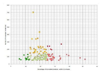
I know I am in danger of becoming boring and repetitive but getting this right is important to my research. Again I am using the CAD immediate call dataset. I have excluded all grid squares that had less than 50 immediate incidents in 2009 on the basis of the low number problem discussed previously. My colour selection has been a bit random up to now. The traffic light system is commonly used in management reports in the MPS so I have decided to use it here as the police are the target audience for this data. Red represents areas of concern, green good areas and amber in between. I have used two reds and two greens, the dark colours represent the extremes. You will notice that I have decided that the overlapping blue/green squares used previously should be a separate cluster. These are the grid squares of most concern and shown as dark red.
This to a certain extent is a subjective decision about the relative importance of response times and number of incidents within a grid square on public perception. Arguably the grid squares on the extreme right of the graph should also be dark red. I should perhaps follow my own advise and keep the data raw. I should decide which data indicate police activity, in this case response time and which data indicates public demand, in this case number of incidents.

Friday 12 February 2010

Fear of Crime, Police Activity and Confidence in the Police


"CrimeReports has found that sharing crime data publically breeds trust in local law enforcement and provides citizens with a way to keep themselves informed. When law enforcement shares data with the pubic, they are entrusting citizens with the power to participate in their own crime prevention efforts. Citizens feel like they are in control. And in return, the citizens give that trust back to the law enforcement agency."


This is a quote from James Gunter in this post on his blog. This sounds a bit like a sales pitch but it is an assertion that I agree with but I would not limit it to the sharing of crime data - more about that later. It fits in with my understanding of the published academic research in this area which I am very interested in because I want to be able to link the performance measure of confidence in the police back to fear of crime via police activity, most notably police patrols.

I try to devise simple diagrams or models for myself to allow me to ruminate over a particular concept. I have shared one already about the fear of crime in a previous post. Today I am sharing another one of my fear of crime diagrams to help try to explain how the partnership approach between the police and the public can work to their mutual benefits. It is all based on good communication.
Firstly let me try to explain the diagram above in a few sentences. I hope to publish a more detailed discussion in the next few weeks that I will link to this blog.
The diagram is called the PAW model not because it looks like a paw of a dog or cat but because I argue, based on numerous academic sources, that "fear of crime" is made up of three separate and sequential elements - Perception, Assessment and Worry.
  • Perception is a global view about the level and nature of crime and disorder
  • Assessment is where that perception is applied personally in a way that the risk of being a victim of crime can be avoided or mitigated
  • Worry occurs if the risk cannot be avoided or mitigated

Confidence in Police is linked to people's perception of crime and disorder and how effective and efficient police are at dealing with it. Generally people accept that it is their responsibility not police to assess the dangers and act sensibly. Worry is the negative aspect of fear of crime and occurs mainly where people live or have to go - places and times people cannot avoid. This the reason why prioritising residential crimes is a correct policy.

How does communication, such as, Internet crime mapping fit in? Fear of crime spirals out of proportion to reality when perception of crime and disorder is wrong. This can lead to inappropriate crime prevention and unnecessary worry. Police, by providing information allows more accurate perceptions of the crime and disorder problems leading to positive crime prevention and worry outcomes. This, if done correctly, leads to the public feeling that the police are on their side working to tackle the problems that affect them, thus increasing confidence in their police.

Thursday 11 February 2010

Revising, refining and hopefully improving


I mentioned that the methodology included revising and refining, and hopefully improving. Today I have included a graph and map that I think is an improvement on that I posted yesterday. I have used the same downloaded data but instead of using the the average response time for each grid square on the x axis I have used the the percentage of immediate incidents that have response times of greater of 12 minutes for each grid square. I have used the same clusters and colours. The police target is to respond to 75% of immediate calls in 12 minutes. Prior to the implementation of Neighbourhood Policing the target was 85%. When I led a response team in Ealing and Acton about seven years ago we achieved the 85% without difficulty but then that was the priority and there was very little community policing................leading to the Reassurance Gap.............the rest is history.
The overall response rate is for this borough for this performance indicator was 78% for 2009 - well within target. However the blue squares show areas which did not achieve this target in 2009, that is over 25% outside 12 minutes.
At this stage I probably should mention the problem of scale, the arbitrariness of grid squares and the problem with low numbers.
  • Analysis is carried out on different scales. Even though the underlying data is exactly the same the visualisation of that data will produce different results depending on the scale used. This dataset is a good example because grid squares that are on the opposite ends of the graph are geographically next to each other. This means that doubling the scale will amalgamate these squares producing an aggregate result. Halving the scale (if the dataset will allow -not in this case) will potentially give more definition but it will aggregate the problem of low numbers that is part of this dataset (see below).
  • The location of the grid square frame is arbitrary. If the grid frame is moved in any direction the results will be slightly different especially if a grid gains or loses a high street.
  • The problem of low numbers is a simple concept to do with probability best illustrated by an example. When you flip a properly weighted coin you know there is a 50% chance that it will land heads up and a 50% chance it will land tails up. But if you only flip the coin say three times it is not that unusual for the three results being all heads or all tails. The probability of this happening 4, 5, 6 etc in a row dramatically reduces with each flip. Therefore relying on low numbers to make inferences or hypotheses is unwise.

The problem of scale and grid are unavoidable but the problem of low numbers is simple, just get rid of them from the analysis. I have not done so up to now because of a public perception of the police reason. I am a member of the Automobile Association (AA) for which I pay about £150 a year for a premier service, anything they offer - homestart, breakdown, roadside relay, etc. I should get. I have been a member since 1988. In the early days when I had older and mechanically unreliable cars I use to call them two or three times a year and I was generally pleased with service I got because I was getting good value for money. I have called the AA only twice in the last ten years (I think) on both occasions I have been unsatisfied with the response I got. On the second occasion they refused to come out for a Homestart because they were overstretched even though I probably paid over £1000 into their coffers for that one call. (That's weird I feel an emotional release now I got that out in the open!). Coming back to the point, low numbers are very important to the police. These are the calls they really should be getting right.

This where I come back to the confidence in the police measure. What is of concern is if the blue squares are residential locations then the very people that they wish to provide a premium service to (see the end of my previous post) are the ones who are apparently getting second best.

Wednesday 10 February 2010

3rd, 4th & 5th clusters and comments about methodology


I am quickly commenting on my final three clusters. The third cluster represents grid squares with fast average response times (under 7 minutes) and low number of immediate incidents in the year (under 150). These grid squares I am guessing are prodeminantely occupied by offices, warehouses and industrial premises - non-residential. The fourth cluster, the grey squares, I think, are grid squares that have mixed premises types in them as they show no extremes. There is obviously a fifth cluster of grid square of no incidents that are shown blank on the maps.
For completeness I should probably mention that the second cluster -blue has a slight negative correlation of -0.30, the third - purple a slight positive correlation of 0.28 and the fourth - grey a very slight negative correlation of -0.13.
There are few more things I want to say. This borough, which I realise is now becoming identifiable, is a borough I never worked in in my 30 year police career so this is an area of London I do not know very well. So my initial analysis is based on the data I have presented and my knowledge of police work and police information systems. The methodology I am using requires that sensible clustering and hypotheses to be made based on logical analysis of the data available. This leads to new lines of research, gathering more data/information to confirm the validity of my decisions or otherwise. This is a revising and refining process which hopefully will end up with a robust clustering and hypothesis.

Tuesday 9 February 2010

Cluster with the Slow Response Time


This post continues with the analysis of response times for CAD immediate incident calls on a London borough. This analysis is carried out with the purpose of discovering geographical variations in police performance, trying to discover the reasons for these variations and trying to link them to confidence in the police.

The second cluster I have selected are those grid squares where the average response time is greater than 10 minutes. My initial hypothesis for this cluster is that the grid squares contain mainly residential areas which are off the main roads, in places that police do not so regularly patrol and locations that police are less familiar with. For instance, an address that is flat 1032a, Sampson House, Peabody Estate will inevitably have a longer average response time than the Red Lion Public House, High Street.

There are two grid squares that meet the criterion of the first and second clusters. Using the data presented so far I would suspect that any residents in living in these grid squares will have a higher level of dissatisfaction with police performance than residents of other grid squares.

Cluster with high numbers of calls

Today I have shown the same graph that I published yesterday and highlighted my first cluster points in green. I have then mapped these grid squares below. These grid squares represent the the busiest areas for "I" calls in 2009. Within this cluster there is a small negative correlation between the two variables of -0.22 meaning there is a tendency for grid squares with more calls to have a better average response time than those with fewer calls. My initial hypothesis for this, which may be shown to wrong, is that these grid squares are ones with high numbers of pubs, clubs, shops and transport hubs - places where people congregate, that is, not predominately residential locations. This would account for the high number of calls and the fact that police respond quickly. These are places where police tend to patrol, they are easy to get to because they tend to be on main roads, and the call venues tend to be well known so there is no delay in finding out where they are.

Monday 8 February 2010

Confidence in the Police and the Dizaei case

I need to be careful what I say in this post. I feel it necessary to comment on the breaking news that Metropolitan Police Commander Ali Dizaei has been sentenced to four years for misconduct and perverting the course of justice.

Recent research into confidence in the police in the UK has centred around police priorities, style and competence. This is a reminder that honesty and the correct use of authority are factors that are also very important. The best the MPS can hope for is a score draw in this case.

At least the MPS have avoided a nightmare scenario of Commander Dizaei being found not guilty for a second time on serious charges and expecting to resume his highly privileged and powerful policing role. It reminds me of the fact that up to 9 million people are having to undergo criminal records checks if they work or their social lives involve interacting with children outside the family environment following the Bichard enquiry (see my previous post here on this subject). Decisions are made with reference to relevant intelligence, allegations, discontinued cases and acquittals. The public would be reassured I am sure if they thought the same standards applied to police employees with regard to matters to do with dishonesty, corruption and abuse of authority.

Analysis of police response times to emergency incidents

Graph of the number of calls to the police graded
as Immediate Response in 2009 for grid square
plotted against the average Response time
for that grid square


As I mentioned in a previous post I have started carrying out analysis on another London Borough. I am doing this with the full knowledge and co-operation of the senior police managers on that borough. They have given me permission to publish my analysis on my blog and I have permission to identify the borough. I decided not to identify the borough for a number of reasons. The main reason is I do not want my analysis to be quoted out of context and used to criticize the police. Nothing within this analysis is intended to be critical of the police, though the main reason why the police are facilitating this research is to learn ways of becoming even more efficient and effective. Another reason is that this is experimental research, in a sense that it is new and previously untested. I am publishing it as I do it. This means that there is a high risk that I may make mistakes and that I may come to the wrong conclusions, which I will subsequently have to revise. I do not want this to cause any difficulties to the police. Lastly just a quick note to say that the data I download from the police computer systems do not contain information which can identify individuals, therefore the data published in map or graph form cannot either.

The graph that I have included at the top of this post is from the Metropolitan Police Service (MPS) incident logging computer system, Computer Aided Dispatch CAD. When a call comes in from the public, usually by telephone, it is graded depending on its assessed urgency. The most urgent calls are graded as to be dealt with immediately and are known as "I" calls. There is a target time of police arriving at the scene of the incident the call relates to within 12 minutes. The types of calls which are graded "I" are those where there a possibility the police can provide assistance to a person or people in danger and/or prevent or detect a crime by rapid attendance.

The CAD system is now almost 30 years old, meaning that it was designed at the same time as the Sinclair ZX81 (my first computer with a memory of 16kb!) and in my opinion one of the best designed MPS computer systems. There have obviously been numerous upgrades but there are certain design features that remain. One of these is how locations are recorded. Without going into too much detail, locations are only accurate to a grid square that is 250 meters by 250 metres. The incidents that occur within the grid are recorded at the central point of the grid. As it is imperative for calls that occur within a borough to be assigned to the right borough police to deal with there is a detailed gazetteer within CAD that can assign all locations to the right borough that operates separately to the grid system. This means that even if a grid square straddles a borough boundary, as many do, the calls will be accurately split between the two or more boroughs which share that grid square. This level of sophistication does not occur at sub-borough level meaning that it is difficult to totally accurately plot calls at ward and sub-ward level.

My analysis therefore uses the same grid squares as CAD. The graph shows each grid square as a point. The location of the point on the x and y axis is determined by the number of I calls that occurred with in that grid square in 2009 on y axis and the average response time for those calls on the x axis. There are over 400 grid squares that are contained within the borough or straddle the boundary. 317 had 1 or more "I" calls in 2009.

This graph provides a simple analysis of how these two variables relate to each other. In this dataset there is almost perfect non correlation between the two datasets. If the higher the number of calls a grid square had the higher the average response time the correlation would be positive and the equation that work these things out would have produced a result of 1. If the higher the number of calls the lower the average response rate the correlation would have been negative, that is -1. In this case the result is very close to zero.

Surprisingly, even though the dataset looks complex and disorganised it can be split quite easily into four clusters that have police operational relevance. That will be the subject of my next post.

Friday 5 February 2010

Confidence in the Police and Geography

I cannot over-state how important the overarching performance indicator of increasing the public's confidence in the police is to the police!!! Now I have got that sentence off my chest I can breath easier.

I will briefly explain why this performance indicator is now ruling the roost, how it changing the way in which we are being policed in London and what it has to do with crime, fear and mapping.

There is a history which I will list and simplify.
  1. 1980-2000 policing performance is primarily centred on detecting and reducing recorded crime and responding quickly to calls from the public.
  2. This led to police patrols being in vehicles rather than on foot and along with intelligence and investigation units, only treating recorded crimes as priorities.
  3. Even though police were successful in achieving their performance targets the public was feeling unsafe, fear of crime was rising and confidence in the police was in jeopardy.
  4. 2001 this mismatch between police priorities and the public's needs and expectations is identified by the police and termed the Reassurance Gap.
  5. The potential consequences of allowing the Reassurance Gap to continue to widen hits the senior policy makers and strategists between the eyes.
  6. They realised that if confidence in the police kept falling this would lead to non-cooperation with the police and the criminal justice system, lack of compliance with the law and ultimately communities and individuals taking policing into their own hands without reference to the legal system of the country.
  7. 2003 Reassurance Policing was introduced to address fear of crime by introducing dedicated foot patrol community policing teams. In about 2005 this style of policing was rebranded as Neighbourghood Policing.
  8. 2008 the overarching performance indicator of Increasing the Public's Confidence in the Police is introduced in England and Wales.
  9. 2010 "Walking is Working" and single patrols are at the forefront of the Metropolitan Police Service publicity campaign.

Confidence in Police is measured by independent market research type companies by questioning a small sample of the population of London. These people are asked about their experiances of policing, crime and disorder in their local area. This means that local police are now most concerned about crimes that happen to adult local residents not to people that live elsewhere.

The priority of crimes types are now judged on this basis. Residential Burglaries become the number one priority with anything that happens in the home not far behind, for instance domestic violence and disputes. Similarly antisocial behaviour affecting residents goes up the hierachy.

This, perhaps is not an entirely predicted outcome of the confidence measure, is happily in my view positive due to the nature of the fear of crime. I will explain this in a later post. What I want to leave you with is the thought that policing is becoming even more geographical with this emphasis on what is local. This is a fertile area for mapping and spatial analysis. Again more thoughts on this later.

Wednesday 3 February 2010

Fear of Crime

This blog entry continues with a discussion about perceiving and measuring crime, that in my view is essential to understanding the mapping of crime.

Hopefully to a large extent the above figure, that I have devised as part of my way of understanding and explaining fear of crime, is self-explanatory.

It helps to explain the Reassurance Gap that I have referred to in previous posts and leads me onto dissecting the elements that make-up the fear of crime which I will tackle in later posts.

Add Image

Tuesday 2 February 2010

Single patrols and fear of crime

Copyright Evening Standard

The Metropolitan Police Service latest advertising campaign is about foot patrols - "walking is working" - a double meaning positive message reminiscent of negative message "Labour is not Working" that started the Saatchi fortune back in 1979. The posters for campaign were the subject of a previous post.

Apparently there is a protest on Facebook led by Police Community Support Officers and some Police Officers against single patrols. On the basis, as far as I can see, that patrolling on your own is by its nature unsafe. Here is the story in the Evening Standard.

This is where I am going to swing the lamp and start talking personally. In my police career I have worked in some of the thought to be more dangerous places in London -for instance Hackney Borough and those thought to be less dangerous - for instance Hillingdon Borough and a lot of the time I patrolled on my own. I am a supporter of single patrols with a number of provisos.

Firstly why am I a supporter of single foot patrols? The reasons are quite complex and I do not have the time to spell them out in detail here but can be summed up by saying that it makes young inexperienced officers stand on their own two feet and interact with the public on their own without having a safety net of a colleague. Patrol becomes a more community interactive exercise where personal tactics and strategies to detect and prevent crime, and solving problems are devised. Patrolling in pairs can become a stroll with a friend.

What are the provisos? The major proviso is that there must be enough other police officers available to come to the aid of a single patrolling officer when s/he needs help. As a supervisor I would more likely double people up if we were short on parade than if we had the full crew for that reason. That means not dispensing with response vehicles to allow more single foot patrols.

The second proviso is the training, skills, expectations and physical fitness of those employed by the police. Policing, especially police patrols, by its nature is not suited to everyone. It could be argued that people who in their personal lives would never consider walking in their own neighbourhood after dark on their own are not suited to police patrol work. Unfortunately such people are employed by the police for patrol work, so it is not surprising if they expect to be accompanied in their patrols.

My last point is one of perception and fear of crime. It comes back to a conversation I had with an American police officer who wanted to convince residents of a housing estate in a city in the United States that he policed that the crime levels had fallen sufficiently for them to have a lower fear of crime and start frequenting and enjoying the communal places on the estate. I said "Do your officers patrol the estate on their own, or only in numbers?" He said "I patrol it on my own but the other officers refuse to." I said "You cannot expect the residents to think the estate is safe, if your officers do not think so. Police have to take the lead, when resident see single patrols they might start believing you."