Search This Blog

Friday, 16 April 2010

Comparing Geodemographics with IMD

In the last post but one I discussed the English Indices of Multiple Deprivation (IMD). In this post I introduce the Geodemographic Classification created from the 2001 Census by various academics for the Office of National Statistics. It originally was classified at Output Area but I am using the larger unit classification of Lower Super Output Area that was published in 2008. Guidance can be found here and the data here.

National Statistics 2001 Area Classification of Lower Super Output Areas showing Supergroups, Groups and Subgroups in the London Borough of Camden

Comparing Area Classification with IMD ranks (the lower the rank the higher the deprivation)

The reason I have used the LSOA scale is that it allows comparison with the IMD. I have shown this above. I have devised a hybrid scatter graph to display the combination of ordinal data - IMD and nominal data - the geodemographic to aid in understanding the similarities and differences between the two datasets.

The table above gives an example of IMD and Area classifications being used for analysis purposes. This comes from a relevant and interesting recent publication that I will return to in later posts.

Wednesday, 14 April 2010

Data, but is it communication as we know it?

You may notice that I have only one link on this site and that is to a CASA group blog that this blog is automatically copied to. CASA is the Centre for Advanced Spatial Analysis. It is a research lab within University College London. Its web site is here. I am proud to be part of the organisation. It carries out highly academic ground breaking research.

I attended a conference yesterday where some of this research was presented. An interesting and worthwhile day. It ended with a panel of eminent Professors - Mike Goodchild, Keith Clarke, Dave Maguire, David Rhind and Carl Steinitz.

I want to make comments on what was said about communication and trust in information/statistics - themes of this blog. Carl Steinitz made an eloquent point about communication being a two way process where the person providing the information understands the expectations (and knowledge) of the person receiving the information. In my opinion the trouble with official statistics, and I write from the perspective of crime statistics, is that they are compiled by experts for experts to analyse. Crime statistics are actually extremely complex in what they do and do not reveal. I say trouble because in this age of apparent openness and transparency statistics that were compiled and used by a select few are now being made available to everyone without proper explanation. This is not communication. Lack of trust can be a consequence of lack of communication.

One of the many things CASA does is create mood maps based on simple Internet surveys. These have been used by Radio 4 and regional BBC newsrooms to create maps about people's attitudes to the recession, congestion charges, crime and disorder and no doubt other things. Not for the first time I got the impression that many academic colleagues feel that CASA should not be involved in such "unscientific" (read nonacademic) survey methods. These academics miss the point; this is communication in the same way as Twitter, Facebook, TV, emails, the Internet are communication. It is incomplete information, as are official statistics, but it is incomplete information that people expect, understand and can evaluate.

Monday, 12 April 2010

Deprived

"Indices of Deprivation are an important tool for identifying the most disadvantaged areas in England so that resources could be appropriately targeted" (Noble et al 2008). These indices are subtly different from geodemographic classifications that I have discussed previously on this blog. Geodemographics is the “analysis of people by where they live” (Sleight 1997 quoted in Harris, Sleight and Webber 2005 page 2), whereas Indices of Multiple Deprivation (IMD) can be said to be the collation of data pertaining to place with reference to people who live and work there. The emphasis is on the most deprived areas but the whole of England is covered at the detail of Lower Super Output Area. This means that there is a grading and ranking of deprivation throughout England from 1 - the most deprived to 32,482 the least deprived.

The IMD brings together 38 different indicators which cover seven officially recognised domains of deprivation: Income, Employment; Health and Disability; Education, Skills and Training; Housing and Services; Living Environment; and Crime. A numerical value is produced for each LSOA for each domain.

Okay that's the preamble. You can find out more if you wish by following the reference links above.

So why am I interested in the IMD? Well if you remember from my discussion of incivility theories previously there is a suggestion in broad terms that areas that are deprived (or in colloquial terms, rundown, uncaredfor, etc.) are characterised by high crime and disorder and that high crime and disorder (in a chicken and egg type way) contributed to the area becoming deprived.

So if we assume that these theories are true and stretch that truth to the limit we can make a simple relationship for analysis purposes:

"The higher the deprivation the higher the crime; the lower the deprivation the lower the crime."

To allow this to work you need good measures of deprivation and good measures of crime and disorder.


Comparing the Multiple Deprivation Score with the Crime and Disorder Domain Scores in Camden showing no correlation between the two


Comparing the Multiple Deprivation Score with the other Domain Scores in Camden showing high correlation between the two


Comparing the Multiple Deprivation Score with the other Domain Scores in Camden showing no correlation between the two

Comparing Camden with London

Comparing Residential Burglaries in Camden in 2009 with Multiple Deprivation Scores and Crime and Disorder Scores showing no correlation


Above I have presented various statistics to show that in Camden, in common with the rest of London the selected recorded crime figures are not a good indication of multiple deprivation. Income, employment, health and education appear to be better single domain indicators. This is partly to do with higher weightings these domains are given in the multiple indices.

There are two broad possibilities - the incivility theories are wrong or the measures are inaccurate or incomplete. Having studied the way the figures are compiled I am leaning towards the crime and disorder figures being incomplete in their scope.

Wednesday, 7 April 2010

Extracting data from Google Maps

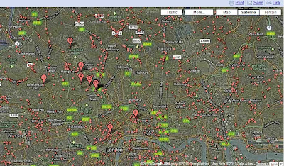
What would like to do today is talk you through how I think I have solved a problem of obtaining some of my data about the characteristics of place. It is with help of Google and it starts with a Google search. In this case I want the co-ordinates of all public houses or bars in the London Borough of Camden so that I can plot them along with other datasets. I reason that alcohol is a major cause of disorder and people being victims of crime. Also location of pubs and bars tend to indicate entertainment venues where people congregate. It would be nice to have every single pub and bar but for my purpose clusters are really what I am looking for. Of equal importance is where pubs and bars are not. A Google search using the "map" option for "Camden public houses" generates the map below.
Each of the red dots purport to be a public house. There are two problems to be overcome. Firstly, it seems that anyone can add a marker to this map- so accuracy is an issue, though most appear to have come from review sites or business advertising listings such as Thompson's local. Secondly the source code behind this map does not allow access to the co-ordinates of the red-dots.

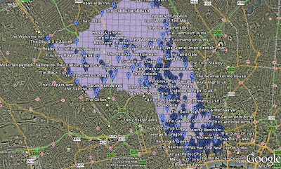
There is a solution to both problems. Google allows users to create their own maps by clicking on "my maps". The map display remains the same but two important options become available. Firstly when you double click on a red dot or any other feature a dialog box appears as normal with information and usually a small picture, but now you have an option of pinning your own marker and retaining the name of the red dot. By going through this process and checking, where necessary, with Google Streetview a list of your own locations can be created. Secondly the option of "View in Google Earth" appears. This allows a .kml file to be created from the personalised layer you have made. This can be opened in Google Earth to display the markers there as shown below. This picture also shows another layer of the clipped Camden Borough grid that I created and converted to .kml file in ArcGIS


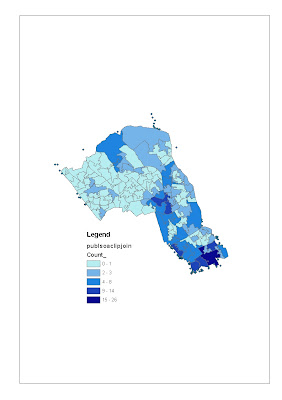
The clever thing is that within the "my maps" kml file there are the names and co-ordinates of the public houses I have marked. The way in which I extract this information is simple. I create a .xml file by renaming the .kml file (just replace k with x). This allows the file to be opened by MS Excel. A little bit of formatting and deleting allows a .csv file to be saved that can be loaded into ArcGIS to create the maps below after a spatial join.

Locations of Public Houses and Bars in the London Borough of Camden shown within Grid Cells

The Location of Public Houses and Bars in the London Borough of Camden shown with Lower Super Output Areas

I have deliberately left the dots of pubs and bars just outside Camden showing. Firstly to remind me that the projection of the grid and the dots are out by about 30 metres due to the use of different co-ordinate systems - I need to learn how to solve this. And as the borders of boroughs often follow historic main roads where pubs are located this is important. It also reminds me that the potential influence of a pub on crime and disorder is greater spatially than its actual location.

I have demonstrated the process with one set of relevant data. I now have access to the Google Data warehouse for my domains.

Thursday, 1 April 2010

Advantages and Disadvantages of Different Spatial Scales

This is my first attempt to categorise the issues of scale.